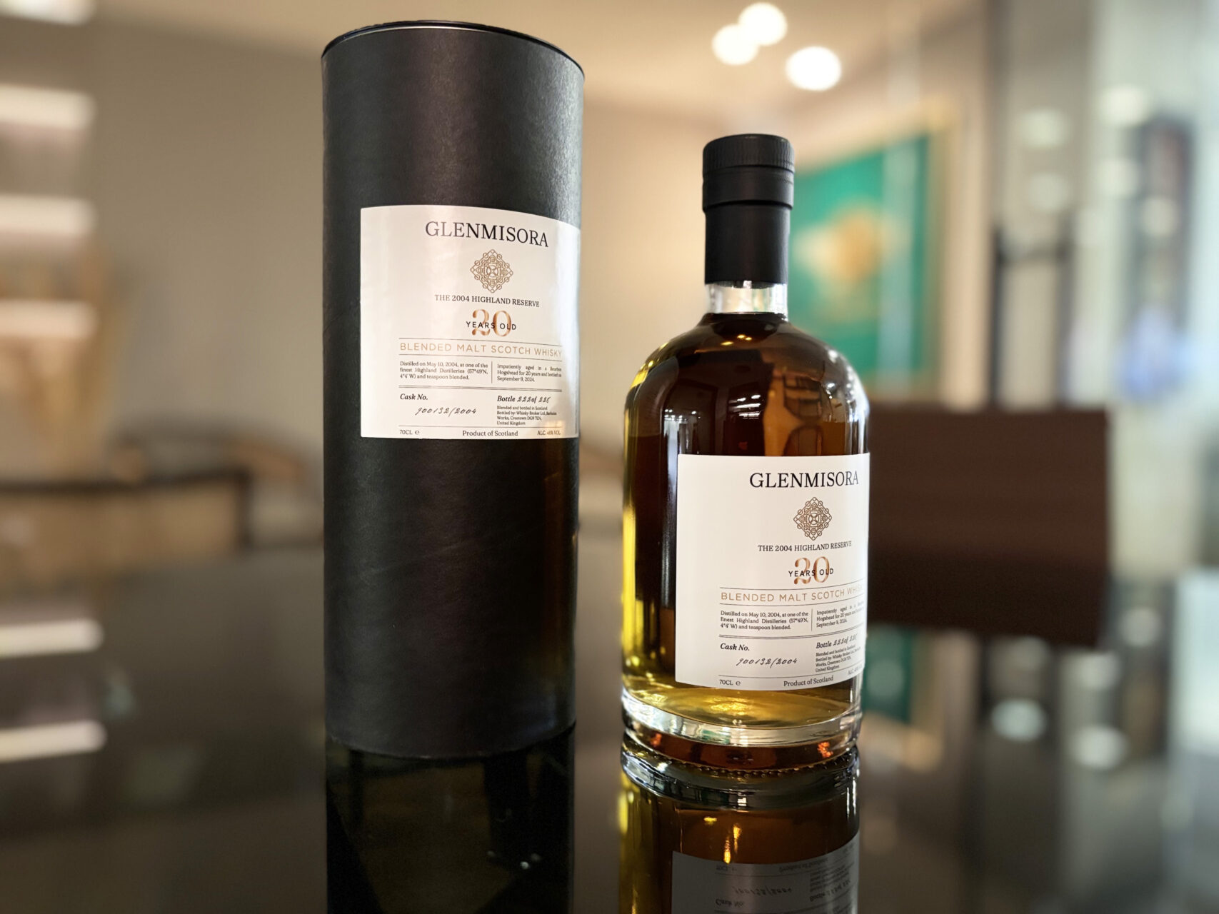
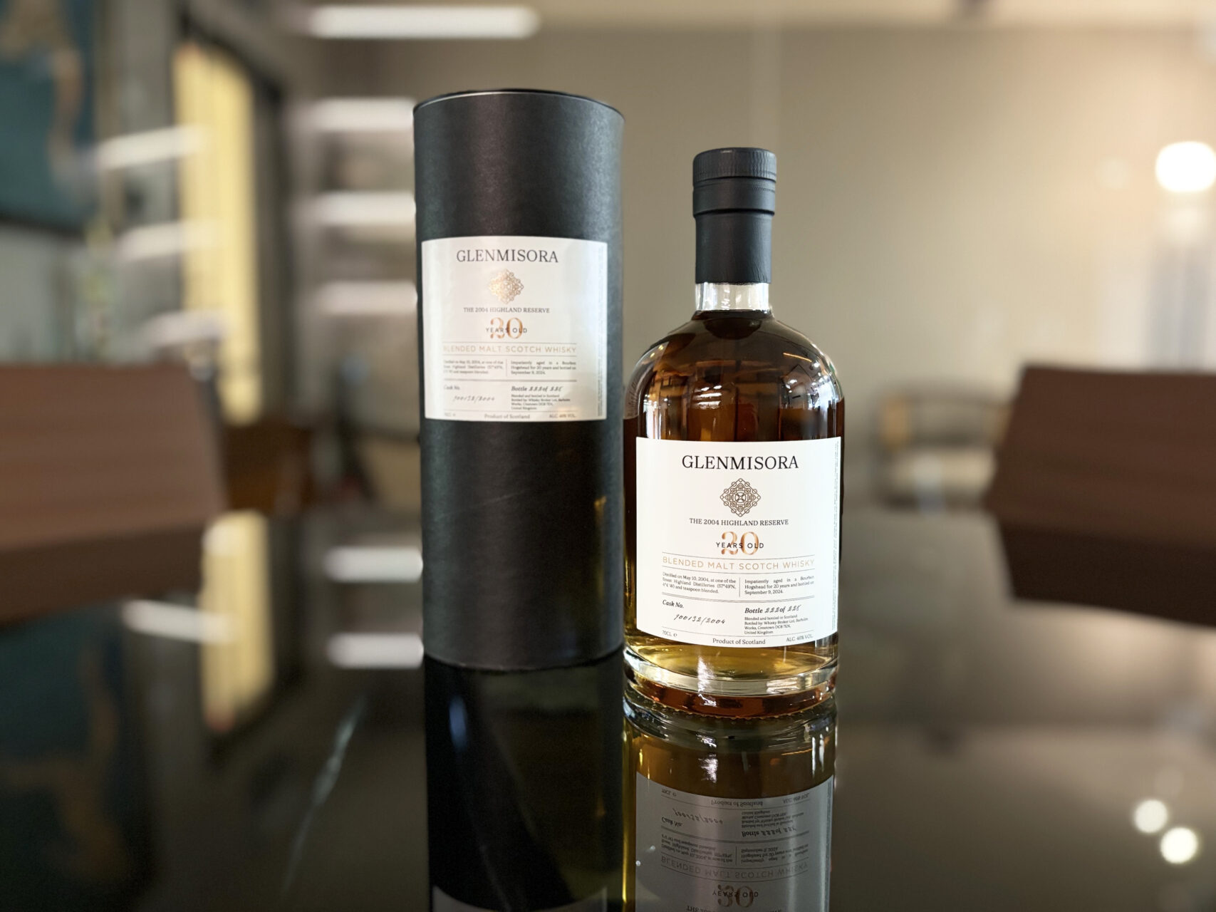
The client sought a label that captured the quiet authority of a matured Highland whisky: unpretentious, yet commanding. The design needed to reflect the whisky’s origin, long maturation in bourbon hogsheads, and its cask-strength identity. It also had to convey a sense of rarity and authenticity for a private banker’s collection. Printed on a textured matte stock, the label evokes the tactile satisfaction of aged paper and contrasts beautifully with the amber tone of the spirit. A minimal use of gold foil adds just the right amount of prestige without detracting from the product’s honesty.
Brand Identity System, Creative & Art Direction, Packaging Design